Introduction to Wedding Color Palettes
Your wedding color palette sets the visual tone for your day. Think of it as your visual compass, guiding everything from bridesmaid dresses to table settings. Neutrals like ivory () and taupe () can form the base, while accents like deep burgundy () or sage green () add depth. Why is it important? Consistency. A cohesive palette ensures every detail feels intentional, not haphazard.
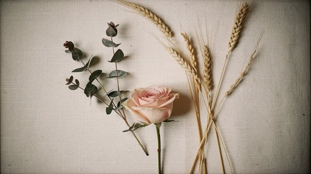
Start with the season. Spring invites pastels like blush pink () and mint (). Summer leans towards bold hues like coral () and turquoise (). Fall loves earthy tones like terracotta () and mustard (). Winter embraces rich jewel tones: emerald () and navy (). Don't just pick colors you love; consider the venue's existing color scheme to avoid clashes.
Common pitfalls? Too many colors can overwhelm. Stick to three to five shades. Also, avoid trendy colors that might date your photos. Instead, opt for classic choices that reflect your personal style. For a fast and tailored solution, the VeilBoard quiz offers a 60-second visual journey to your perfect palette.
Popular Wedding Color Palettes by Season
Popular wedding color palettes by season align with nature's cycles: pastel blooms for spring, bold hues for summer, rich shades for autumn, and icy tones for winter. Spring weddings shine with blush pinks (), soft lilacs (), and mint green (), often paired with peonies and ranunculus. Summer brings bright coral (), sunny yellow (), and turquoise (), perfect with sunflowers and dahlias. Autumn embraces deep burgundy (), burnt orange (), and mustard yellow (), complemented by chrysanthemums and marigolds. Winter palettes feature frosty blues (), silver (), and rich emerald (), paired with white roses and pine greenery.
How to Choose Your Wedding Color Palette
Choosing your wedding color palette is about blending personal style with practical considerations. Start by picturing the season; a winter wedding might call for deep burgundy and pine ( and ), while spring suits blush and sage ( and ). Next, consider your venue's existing colors; a rustic barn might pair well with burnt orange and cream ( and ). Think about the mood you want to create: romantic with dusty rose and gold ( and ), or modern with slate and ivory ( and ).
- Identify your favorite colors and consider how they work together.
- Match colors to the season and venue for cohesion.
- Use a color wheel to find complementary and contrasting shades.
- Limit your palette to three to five colors to avoid visual chaos.
- Test swatches in various lighting to see true tones.
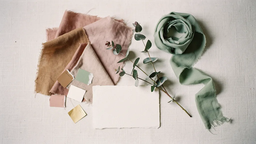
Consider the materials and textures, too. Velvet in emerald () adds luxury, while linen in soft peach () feels airy. Avoid common mistakes like ignoring the venue's decor or choosing trendy colors that might not photograph well. Tools like Adobe Color and the VeilBoard quiz can help you visualize and refine your palette quickly.
Tips for matching colors with wedding themes
Matching colors with your wedding theme involves considering the mood and style you want to convey. Start with the theme's core elements. For a bohemian wedding, think muted earth tones like terracotta () or sage green (). A classic ballroom affair might demand rich jewel tones, emerald () or deep navy (). Choose a primary color, then add one or two complementary hues to keep it interesting without overloading the senses.
Consider the venue's existing color palette. A rustic barn may already have warm wood tones that pair beautifully with dusty blue (). Fabrics matter too. Lace can add elegance, while burlap leans casual. Flowers like peonies or sunflowers can tie it all together. Always test swatches in your venue's lighting. Colors shift under different lights, and what looks chic in daylight might feel drab at dusk.
Don't forget about the season. Spring favors pastels like blush pink () and lilac (), while autumn invites rich maroons () and burnt oranges (). If you find yourself overwhelmed, tools like the VeilBoard quiz offer a swift way to discover a cohesive, stylish palette that suits your theme perfectly.
Real Wedding Color Palette Examples
Real wedding color palettes often combine three to five hues that reflect the couple's style and the season. Think of a summer wedding with coral (), mint (), and ivory (), a refreshing trio that pairs well with peonies and eucalyptus. For fall, a rich palette of burgundy (), burnt orange (), and sage () complements dahlias and pampas grass. Winter weddings shine with deep navy (), silver (), and crisp white (), ideal alongside anemones and dusty miller. Spring invites pastels like lavender (), blush (), and pale green (), perfect with ranunculus and hellebore. Each palette tells a story, capturing the mood and essence of the day.
Step-by-step guide to creating a personalized wedding color palette
- Identify your favorite colors and styles. Start by browsing your closet, home decor, and Pinterest boards for colors you love. Look for patterns: are you drawn to muted tones or bold hues? This personal touch ensures your palette feels authentic.
- Consider the season and venue. A winter wedding in a historic mansion suggests rich tones like burgundy () and forest green (), while a summer beach ceremony might lean toward coral () and seafoam (). Your setting should enhance your colors, not clash with them.
- Choose a dominant color with two or three complementary shades. A hero color like dusty blue () can anchor your palette, with accents like peach () and gold () adding depth. Think of it as a painting: the main color is your canvas, the accents are your brushstrokes.
- Test your palette with swatches and samples. Order fabric swatches, ribbon, or paint chips to see how your colors look in real life. Lighting can alter colors significantly, so check them in your venue's lighting conditions.
- Create a digital mood board. Use tools like Canva or Pinterest to compile your colors alongside textures, florals, and decor ideas. This visual reference keeps your vision consistent and helps communicate it to vendors.
- Refine with feedback. Share your palette with a trusted friend or planner. They might spot a clash or suggest a tweak that makes the scheme sing. A second set of eyes can catch what you might miss.
- Finalize and share with vendors. Once you're happy, distribute your palette to your florist, caterer, and stationer. Consistency across all elements is key.
Creating a color palette that reflects your personal style involves balancing your preferences with practical considerations like season and venue. If you need a shortcut, the VeilBoard quiz can generate a tailored palette in just 60 seconds, ensuring your wedding aesthetic is cohesive and uniquely yours.
Common mistakes to avoid when choosing wedding colors
Choosing wedding colors without considering the venue's existing palette is a common mistake. Picture a rustic barn with deep mahogany beams; blush pinks and soft pastels might clash. Instead, embrace the setting with rich tones like burgundy () or forest green (). Another misstep is falling for fleeting trends over personal taste. You want a classic feel in your photos, not a dated look. Avoid overcomplicating the palette, three colors are often enough to create harmony without chaos. Finally, neglecting to test the colors in different lighting can lead to surprises on the big day. Always see your swatches in both natural and artificial light.
Interactive tools to help decide on a color palette
Interactive tools like VeilBoard can streamline the process of selecting a wedding color palette by providing personalized aesthetic recommendations. VeilBoard uses a quick 60-second quiz to generate a complete visual package, including a moodboard, color palette, and floral direction. It's a swift route to a cohesive theme, saving you hours on Pinterest. Other tools include Canva's color palette generator, which lets you upload an image to extract a palette, and Adobe Color for crafting custom schemes. Each tool offers a unique approach, but VeilBoard stands out for its speed and tailored results.
Using VeilBoard for Quick Aesthetic Generation
VeilBoard's quiz asks you to select images that resonate with your style, then crafts a set of Pinterest-ready visuals. It's like having a style-savvy friend do the heavy lifting. You get a moodboard, a detailed color palette with hex codes, and decor direction, all aligned to your tastes. This tailored approach ensures your wedding colors feel personal and intentional, not just plucked from a trend list.