
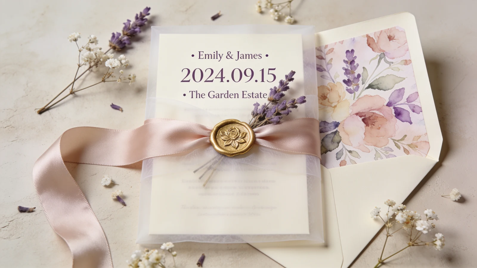
The invitation is a preview, not a separate thing
The invitation is the first physical piece of your wedding a guest touches, weeks or months before the day. A good one is a preview: open it, and you already know roughly what the wedding will look and feel like. That only happens when the invitation is pulled from the same aesthetic as everything else, rather than chosen on its own from a catalog. Three elements carry it.
Pull the palette
Your wedding palette should show up in the invitation, in the ink color, the paper, the envelope, or a printed or painted edge. It does not have to be loud: a cream card with a single sage or terracotta accent and a matching envelope liner reads as your palette without shouting. If you have not locked the exact shades, the color palette generator gives you hex codes to hand a stationer so the ink matches the tablecloths.
Pull the type
Typography sets formality faster than anything else on the card. Flowing calligraphy and classic serifs read romantic and formal; clean sans-serifs read modern and minimal; a period display face reads Art Deco or vintage. Match the type to your aesthetic and keep it to two fonts at most — one for the couple's names, one for everything else.
Pull the materials
Paper and finishing are where an invitation gains texture and signals its style. A few pairings that read instantly:
- Romantic: vellum overlays, silk ribbon, wax seals, blush or ivory stock.
- Modern: heavy uncoated card, a single ink color, lots of white space, clean edges.
- Rustic or boho: kraft or handmade paper, deckled edges, pressed flowers, twine.
- Formal or jewel-tone: letterpress or foil, dark stock, gold or silver edging.
Start from the aesthetic, not the invitation
The mistake is choosing an invitation first and hoping the wedding matches it later. Settle your overall look first, then let the invitation follow. Find your direction in the wedding themes guide, and if it helps to see the whole look together, a mood board keeps the invitation, the palette, and the florals reading as one wedding.